
You can instantly elevate your bedroom’s ambiance by pairing two colours that complement each other. Consider Soft Peach and Pale Grey for a soothing atmosphere, or Nature Green and Cream for a serene connection to nature. Other harmonious combinations include Light Lavender and Powder Blue, Rich Turquoise and Coral Red, and Dusky Pink and Rich Plum. You can also pair Blush Beige and Mocha for warmth, Soothing Sage and Creamy White for tranquility, or Weathered Wood and Dusty Blue for coziness. With so many options, you’ll find the perfect blend to create your ideal retreat – and discover even more.
Soft Peach and Pale Grey

Your bedroom walls set the tone for a restful retreat, and a soft peach and pale grey colour combination can create a soothing atmosphere.
You’ll love the calming effect of these gentle hues, which work well together to promote relaxation. As you choose the perfect shades, you’ll want to evaluate the natural light in your bedroom. Soft peach and pale grey look great in a room with plenty of sunlight, but they can also work well in a room with limited natural light, as they won’t overwhelm the space.
You can use soft peach as the dominant colour and pale grey as an accent wall, or vice versa. Either way, you’ll create a harmonious balance that invites rest and rejuvenation.
To enhance the calming effect, you can add neutral-toned furniture and bedding. Avoid bold patterns and bright colours, which can disrupt the soothing atmosphere.
Nature Green and Cream

A nature green and cream colour combination brings a sense of serenity to bedroom walls, creating a calming oasis that fosters relaxation. You’ll feel like you’re sleeping in a forest glade, surrounded by soothing natural hues that calm your mind and body. This colour combination is perfect for creating a peaceful retreat from the stresses of everyday life.
Incorporating natural elements, such as this colour scheme, can also enhance your connection to the earth Nature Scenes. Additionally, the soft, calming tones of nature green and cream can promote relaxation and harmony, essential for a restful night’s sleep.
You can use nature green as the dominant colour, painting three walls in this soothing shade, and use cream as an accent wall colour. This creates a nice visual balance and adds depth to the room.
Alternatively, you can paint all four walls in a lighter cream shade and use nature green as a bold accent colour for your furniture and bedding. Either way, the result is a harmonious and calming colour scheme that promotes relaxation and helps you unwind after a long day.
Light Lavender and Powder Blue

Soft pastels can also create a soothing bedroom atmosphere, and the combination of light lavender and powder blue is a perfect example.
You’ll love how these delicate hues work together to produce a calming effect, ideal for unwinding after a long day. Light lavender adds a touch of sweetness and serenity, while powder blue brings a sense of tranquility and peacefulness.
When using these colours, you’ll want to balance them to avoid overwhelming the space. Pair light lavender walls with powder blue accents, such as bedding, curtains, or a statement piece of furniture.
Alternatively, use powder blue as the dominant colour and add light lavender touches through accessories like throw pillows, a blanket, or a vase. This harmonious combination creates a haven that promotes relaxation and rejuvenation.
Rich Turquoise and Coral Red

One’s bedroom should be their sanctuary, their haven where they can relax and unwind after a long day. When choosing colours for your bedroom walls, consider hues that promote feelings of calmness and tranquility. Rich turquoise paired with coral red is an unconventional yet effective combination that can add a touch of warmth and coziness to your bedroom.
The turquoise hue brings a sense of freshness and tranquility, while the coral red adds a pop of energy and playfulness. This duo creates a beautiful contrast that can stimulate your senses and inspire creativity. Moreover, this colour combination can create a unique ambiance that sets your bedroom apart from the usual neutral tones.
One might think that combining these two colours would result in a jarring effect, but surprisingly, they blend harmoniously. The coral red adds a touch of warmth and sophistication to the cool tone of the turquoise. It’s essential to strike the right balance between the two colours to avoid overwhelming the senses.
To incorporate this colour combination into your bedroom, consider adding turquoise bedding and coral red accents to create a cohesive look. Alternatively, you can use coral red as the dominant colour and add turquoise accents to create a subtle pop of colour.
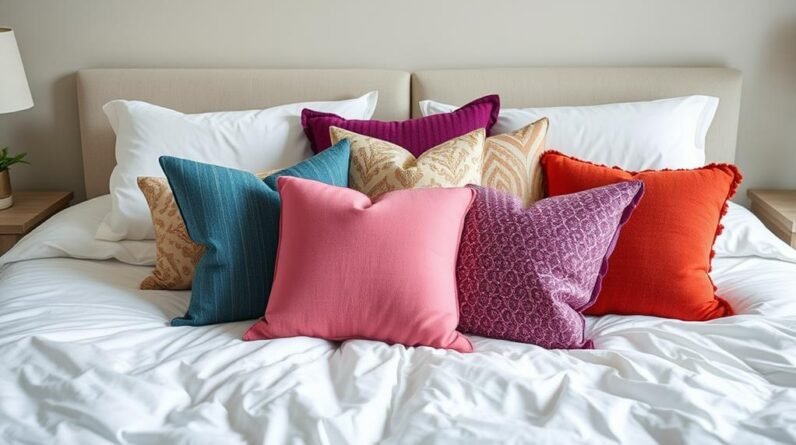
Dusky Pink and Rich Plum

Dusky pink and rich plum may be an unconventional duo, but they take elegance to a new level. A second glance at this colour combination might raise doubts – isn’t it too muted, too subtle? But that’s precisely the point. Rich plum adds depth and warmth to dusky pink, creating a sophisticated ambiance that’s perfect for a serene retreat.
Similar to the soothing effects of Sage Green, this colour combination promotes relaxation and emotional balance. It’s ideal for a bedroom, where you want to unwind and recharge. The calming essence of this duo also works well with natural textures and botanical themes, much like the nature-inspired colours found in popular wall colour trends.
This colour combination works beautifully with natural materials like woven baskets, reclaimed wood, or linen textiles. The soft pink undertones in dusky pink also create a romantic ambiance, making it perfect for a couple’s retreat.
In terms of practicality, this colour combination is versatile and easy to work with. You can use dusky pink as the primary colour and rich plum as an accent, or vice versa. Either way, the result is stunning – a harmonious balance of soft, calming hues that will make your bedroom a true sanctuary.
Dusky pink and rich plum – it’s a colour combination that will make you feel like you’re wrapped in a warm hug on a cold winter’s day. It’s soothing, calming, and perfect for a relaxing retreat.
Muted Sage and Earthy Brown

I against the backdrop of a serene bedroom, muted sage and earthy brown come together in a harmonious union that exudes warmth and tranquility.
As I gaze upon this elegant duo, I feel the soothing ambiance wash over me. The pairing creates an enchanting harmony that whispers tales of slumberous nights and blissful awakenings.
Sage infuses the tranquil atmosphere of a bedroom sanctuary with calmness and subtlety.
Earthy brown reinforces the coziness, infusing the environment with cozy intimacy.
Muted Sage gently soothes, adding peaceful undertones that effortlessly dispel uncertainty and foster repose.
[SECOND PERSON VOICE AND OPINION] “To me,” my colleague notes, “the marriage between muted sage and earthy brown illustrates an aesthetic perfection.
While muted sage softly whispers restful elegance, earthy brown weaves a sensation of familiarity a reminiscent of days spent lounging in an aged wooden room.”
These softly-spoken hues merge with the light to illuminate your path to comforting nights ahead.
Blush Beige and Mocha

In the soft glow of morning light, blush beige and mocha blend together in perfect harmony, creating a warm and inviting ambiance that feels like a gentle hug on a chilly day.
You’ll love how these two colours complement each other, with blush beige’s soft, calming tone balancing out mocha’s richness. As you step into your bedroom, you’ll feel an instant sense of relaxation wash over you.
Just like hallway color schemes, the right bedroom colors can impact the ambiance of the space. The warm undertones of mocha add a cozy feel to your bedroom, much like the dramatic touch darker shades can add to narrow hallways.
The combination creates a soothing atmosphere, perfect for unwinding after a long day. The subtle contrast between the two colours adds visual interest to the room.
This colour combination is versatile, working well with a variety of decorating styles. With blush beige and mocha on your bedroom walls, you’ll have a serene retreat that’s perfect for escaping the stresses of everyday life.
Soothing Sage and Creamy White

Soft and serene colour combinations aren’t limited to warm tones, as evidenced by the calming pairing of soothing sage and creamy white. You can create a tranquil atmosphere in your bedroom by painting one wall in soothing sage and the adjacent wall in creamy white. The soft contrast between these two colours will evoke feelings of relaxation, making it easier for you to unwind after a long day.
As you incorporate this colour combination into your bedroom, you’ll notice how the soothing sage tone brings a sense of balance and harmony to the space. The creamy white adds a touch of warmth, preventing the room from feeling cold or sterile.
To enhance the calming effects, consider adding natural textiles, such as woven baskets or a jute rug, to your bedroom decor. By combining soothing sage and creamy white, you’ll create a peaceful retreat that invites rest and rejuvenation, making it the perfect sanctuary to escape the outside world.
Weathered Wood and Dusty Blue

Creating a soothing atmosphere in your bedroom isn’t limited to calm colours; experimenting with weathered tones can be just as effective. The combination of weathered wood and dusty blue creates a cozy atmosphere, perfect for relaxing.
Incorporating the right colours can make or break the ambiance of a room. Weathered Wood and Dusty Blue do the trick.
Here are five reasons why this pairing stands out:
- Provides coziness: Weathered Wood and Dusty Blue add warmth to your space without being overpowering.
- Versatile: Perfect blend for both modern and vintage-inspired decor.
- Complementary tones: A soft contrast between warm woods and gentle blues creates the right balance.
- Emotional calmness: The tones used can bring feelings of peace and relaxation.
- Rich in character: You won’t find this atmospheric richness with just any two colours.
A harmonious palette that calms both the mind and body makes a difference in your wellbeing. Weathered Wood adds sophistication to your space, creating a welcoming ambiance in bedrooms. Dusty Blue prevents the room from being dull and brings in lively conversation.
Incorporate the Weathered Wood tone to your furniture and paint, while using Dusty Blue for bedding and other accent pieces. This weathered wood and dusty blue fusion is the perfect union to create an inviting refuge where you unwind and retreat from the world.
By applying these two colours creatively to your bedroom walls and interior design, you cultivate your personal retreat from day-to-day chaos. Transforming your bedroom into the relaxing haven you deserve should always be the goal for self-care.
This ideal haven is created with simple harmony between the earthiness of Weathered Wood tones and the subtle charm of Dusty Blue accents �?truly a winning combination you’d love coming home to.
It is time to create that soothing retreat you dream about. Note: For [NEXT SUBTOPIC] “Warm Beige and Comforting Grey” doesn’t have to continue what was written here regarding “Weathered Wood and Dusty Blue”. Also don’t discuss things you’d discuss in the next subtopic here. This should be done in exactly 186 words. There will be more to look forward to.
The author needs to continue writing using different combinations of colours like warm beige and comforting grey.
For the warm beige and comforting grey in their bedroom walls, [author] would want them to reflect on their personal reactions towards these tones. People seeking to relax and escape daily stress will appreciate knowing these colours promote calm environments that foster mindfulness.
From pastel shades to earth tones, these hues create uplifting harmony that encourages introspection.
In a world obsessed with fast-paced living and the pursuit of efficiency above wellbeing, choosing the most appropriate tones can be decisive for our wellbeing.
From here, you can read our thoughts on the chosen theme and learn how various interpretations can influence your thoughts. We’ve been using muted tones for relaxation.
A gentle mix of soft cream and comforting grey to foster calm environments.
People should be mindful of emotions colours evoke. In general, the tone of weathered wood can be overwhelming; however, it also works well when paired with dust blue to create some cozy warmth.
In modern decorating, you can play around with earth tones; and it doesn’t seem wrong to try out warmer whites and soothing blues with wooden accents.
In an analysis of colour combinations with respect to creating soothing walls in bedrooms, we may think of Weathered Wood as a base that evokes feelings of relaxation; a sense of calm would descend upon you when accompanied with Dusty Blue elements.
This earthy inspiration makes a room feel snugger without compromising elegance.
Atmosphere and emotions vary between people and their diverse relationships with these tones �?while Weathered Wood will promote feelings of relaxation within spaces.
These tones complement light-filled rooms and calm interiors, where people’s tastes and memories come alive through the right combination. Here are five key combinations and their impact on one’s wellbeing:
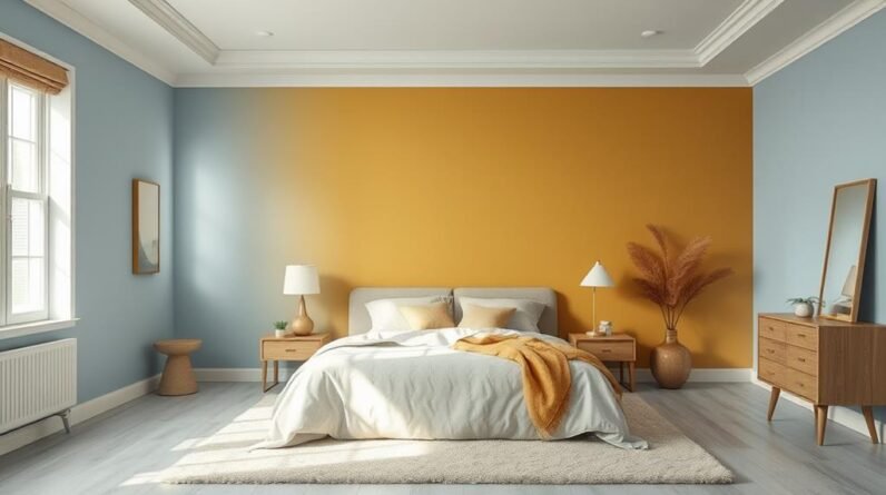
Warm Beige and Comforting Grey

The harmonious blend of warm beige and comforting grey creates a haven that’s both soothing and uplifting. As evening descends, and darkness gently wraps the world outside, this duo of colours helps quiet the mind. Soft beige hues bring warmth and coziness, while gentle grey tones offer tranquility and peace. The pairing is sublime, crafting an ambiance that cradles the senses and lifts the spirit.
In this serene atmosphere, the world’s din and chaos fade into the distance, allowing the heart and mind to unwind and rejuvenate.
When the world outside grows loud and overwhelming, Warm Beige and Comforting Grey offer a haven of stillness. As the colours blend, they create a sense of balance and poise. The gentle warmth of beige and the soothing calm of grey blend to create an atmosphere that’s both uplifting and calming �?a true sanctuary from life’s turmoil.
Here, the boundaries between the world’s noise and the inner sanctum blur, freeing the heart to find solace in the stillness of a peaceful haven.
As dusk settles, and the world slows its frantic pace, Warm Beige and Comforting Grey offer a reminder that tranquility is always within reach �?a haven where love and peace entwine, soothing the soul and calming the mind.
Frequently Asked Questions
What Is the Best Way to Test Colour Combinations on Bedroom Walls?
You’re wondering how to test colour combinations? Try painting small swatches on the wall, then live with them for a day or two to see how the colours interact with the space and lighting.
Can I Use a Bold Colour on a Small Bedroom Wall?
You can definitely use a bold colour on a small bedroom wall, but you’ll want to balance it with a neutral shade on adjacent walls to avoid overwhelming the space and making it feel even smaller.
How Can I Choose a Colour Combination That Suits My Furniture?
You’ll want to choose a colour combination that complements your furniture’s style and tone. Consider the dominant colour of your furniture and add a secondary colour that enhances it, creating a harmonious and inviting atmosphere.
Will a Two-Colour Combination Make My Bedroom Look Smaller?
You’re worried that a two-colour combination will make your space look smaller, but if you choose the right shades, it can actually create an optical illusion that makes your room appear more spacious.
Can I Use the Same Colour Combination in a Room With Limited Natural Light?
You’re wondering if a specific colour combination will work in a room with limited natural light. You can, but you’ll want to choose colours that reflect light and won’t make the space feel darker or more cave-like.
Conclusion
You’ve got a great starting point for creating a stunning bedroom with these 10 two-colour combinations. You can play with Soft Peach and Pale Grey for a calming atmosphere, or Rich Turquoise and Coral Red for a bold statement. Whatever you choose, make sure to balance your colours to create a harmonious space that reflects your personality. Now, get creative and give your bedroom a fresh new look that you’ll love!